We see some common mistakes on our web travels at Talance. We see a lot of them that have to do with image formatting on websites and blogs. No doubt that a gripping image can compel a visitor to spend more time with you or even give you money. But you can ruin the best photo with bad habits.
Here’s what people do all wrong with pictures on websites, and how you can learn from their mistakes.
Infraction: No ALT tag
Not every web browser can see every picture. Obviously, blind people can’t see pictures, but other people have pictures turned off, and some browsers restrict certain kinds of images (hello, Gmail and Outlook). That’s what the ALT attribute is for. It’s meant to be attached to each picture so there’s a text equivalent in case the picture can’t be displayed. At least someone can read a description of what the picture should be.
How to fix it
This one is easy. Every time you add a picture to your site, fill in the ALT text box or “image description” field. Almost every web editor prompts you for this information. Here’s what it might look like:
Where to add the ALT tag
Infraction: Huge image, small space
Many people know how to take an enormous web photo and make it look small. You can set the image to shrink it down to fit in a reasonable sized box on the page. This technique can squish the picture into a weird shape and also slow down the loading of your page.
How to fix it
What’s better is to make the picture smaller to begin with. Pick one of the hundreds of image resizing programs out there – we use Photoshop in the office – and crop it down. It will load fast and look right.
Infraction: No padding
 The eye craves white space. When text is crammed up against a picture, there’s no white space, which makes the page look junky and makes it more difficult to read.
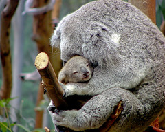
You can see I’ve added a picture here with no padding. See how the words are all mashed up against it? Makes it difficult to see the picture and read the text surrounding it.
How to fix it
Introduce yourself to padding. Padding puts a margin around your pictures, which helps break up text and helps the eye move more fluidly down the page. The best way to add padding is to ask whoever is in charge of building your site to add it directly to the CSS file. But you can add it manually too.
In your image tool on your web editor, look for Image Properties. Sometimes this is in the advanced settings. Look for fields called Vertical Space and Horizontal Space, and enter 10. That will give your picture a nice gutter to help it stand out. See how the same picture as above looks that much nicer just because I added a little breathing room around it? It gives a more polished look to the whole site.