Feedback makes your training programs stronger. But today’s evaluation methods go far beyond simple end-of-course surveys. Modern tools make it easier to collect and interpret insights from learners, supervisors, and subject matter experts so you can see what’s working and what needs to change.
Instead of waiting until a course ends, continuous and formative evaluations let you spot issues early, monitor learner experience in real time, and make improvements while your program is still running. Learner feedback is still essential, but bringing in voices from SMEs, program managers, alumni, and employers ensures your training stays aligned with current practices and real-world competencies.
Digital platforms now streamline the feedback process, while competency-based and validated evaluation models help you measure performance, accuracy, and impact with much more precision.
If you’re ready to make sure your training truly holds up and delivers the results your organization needs. Read on for updated, practical ways to gather, analyze, and act on feedback in today’s rapidly evolving learning landscape.
Why Every Course Needs a Built-In Evaluation Plan
Evaluations should be part of every training program—not just something you do at launch or when problems show up. Training content can become outdated faster than most teams expect: guidelines change, workflows shift, and new staff bring new needs. A regular evaluation plan helps you keep courses accurate, relevant, and effective.
If you follow the ADDIE model (Analyze, Design, Develop, Implement, Evaluate), evaluation isn’t a one-time task. It’s built into every stage of the cycle:
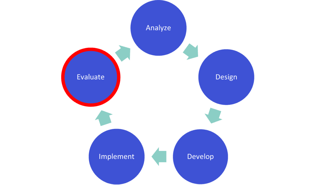
The ADDIE model recommends course evaluation be done in two parts:
Formative evaluation happens while you’re designing and developing your course to confirm you’re meeting learning objectives.
Summative evaluation happens after the course is live so you can identify improvements for the next cycle.
Even if you’re not using ADDIE formally, these principles help any team create stronger training programs. The goal is to establish a predictable, repeatable process for checking quality, accuracy, and impact—not just once but throughout the life of your course. The Training Review Toolkit includes a template you can use to map out your evaluation checkpoints for each course.
Signs Your Training Needs an Immediate Review
If you notice any of the following, it’s time to evaluate your course right away:
- Learners say content is outdated or confusing
- Supervisors notice inconsistent performance
- Completion or pass rates drop
- New policies, regulations, or workflows have been released
- Your LMS reports show unusual patterns (repeated failures, long dwell times, skipped sections)
- Learners request clarification during or after the course
- SMEs identify changes in best practices, clinical guidelines, or community needs
Use the “Immediate Red Flags Checklist” in the Toolkit to quickly scan for issues.
How To Evaluate Your Training Step-by-Step
Modern evaluation doesn’t have to be complicated. Here’s a clear, practical four-step process you can apply to any training program—online or in-person—to catch errors, improve clarity, and confirm accuracy.
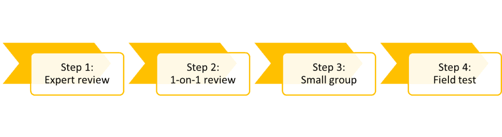
Step 1: Expert review
First, have an expert look at the curriculum you’re creating. An expert will be familiar with specifics a learner won’t, such as health recommendations, best practices, or common misconceptions. They’ll be able to gauge the accuracy of what you’re creating.
An expert review could involve one person or more. An expert could be:
- An instructional designer, who understands how to design and deliver educational material
- A subject-matter expert, who knows the material well
- A technology expert, who can evaluate the success of the delivery system (e.g., learning management system)
Step 2: One-on-one learner review
Next, watch one learner walk through the material. A fresh set of eyes is invaluable: learners spot usability issues, confusing instructions, and inconsistencies experts may overlook.
A learner will spot errors and inconsistencies that someone very familiar with the content could miss. The learner reviewer should be looking for clarity, ease of use, errors, and general feedback. After all, a successful learning experience should be a priority for any course.
The one-on-one review requires just one learner. This isn’t the same as releasing the content to a pilot group for a dress rehearsal. An evaluator or someone to take notes can be in the room to capture feedback.
If you like, you can make updates and have another learner walk through the material, but just one at a time.
Step 3: Small group review
The next step after sitting down with one learner at a time—and making updates to the content based on their feedback—is to assemble a small group.
A small group of learners is like a focus group. The group is guided through the whole training. An evaluator, such as an instructional designer, should facilitate the discussion and make notes. This should be as close as possible to a real learning scenario, but with the intention of gathering more feedback at the end.
Here are some important factors to consider with a small group review:
- Collection method. A written questionnaire, videoing or note-taking are common methods.
- Ask questions that support improvements. Asking questions such as, “How did the training meet your expectations?” might be interesting, but they don’t really provide specifics about how to improve. Choose your questions carefully.
- Ask questions before and after. Measure confidence in completing tasks related to the training by asking questions before the training and afterward. Then, you can measure how well people feel they improved by the time they finished.
Step 4: Field test/pilot
A field test is your near-final check. This is how you confirm the course performs in a real-world environment. The content should be as polished as possible before this step.
The field test and the small group review are very similar. However, you want to ask questions about improvements you made after the small group review. It might also involve a larger group, up to 30 people.
After completing these steps, you’ll have a clear picture of how well your course performs and where it needs improvement. A structured evaluation process reduces redesign time, prevents costly errors, and helps you deliver training that consistently meets your program’s goals.
Updated for 2025 to reflect current training evaluation methods and continuous review practices.
Photo by DilokaStudio on Freepik